Programming/R
[R 시각화] 그래프로 시각화해보기
aram
2023. 8. 1. 16:01
막대 그래프 barplot(height, ....)
f <- c('WINTER','SUMMER','SPRING','SUMMER','SUMMER','FALL','FALL','SUMMER','SPRING','SPRING')
ds <- table(f)
    # FALL SPRING SUMMER WINTER
# 2 3 4 1- width = 막대의 넓이 설정
- main | sub = overall and sub title for the plot.
- col = color
: col= '색상명' | c('색상명', '벡터') | rainbow(색상): 설정되어 있는 팔레트 사용 - xlab = a label for the x axis. x축 라벨
ylab = a label for the y axis. y축 라벨 - xlim = limits for the x axis.
ylim = limits for the y axis. - horiz = 수평막대그래프
- las = x축의 이름 표시 방향
=0 : 기본값, 축방향
=1 : 수평방향(가로)
=2 : 축 기준 수직
=3 : 수직방향(세로) - names = 축 이름 변경
barplot(ds, main='favorite season') #1
barplot(ds, main='favorite season', col=rainbow(4), xlab="계절", ylab="빈도수",
        horiz=TRUE, names=c("F", 'SP','SU','W'), las=1) #2
히스토그램 hist(x, ...)
- 자료의 분포 확인
- breaks = 구간 분리 개수 : 더 크거나 작게 하고 싶어도 시스템이 알아서 최소 구문을 분리함
dist <- cars[,2]
hist(dist, breaks=13) #12로 분리
hist(dist, breaks=5)  #6으로 분리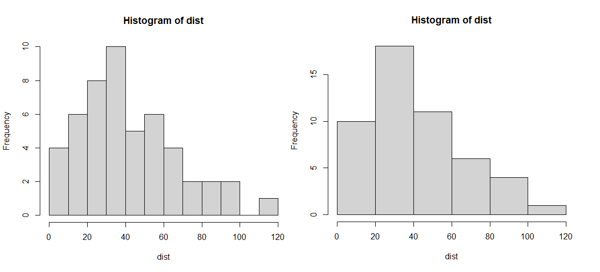
# 히스토그램 정보 보기
h <- hist(dist, main="Histogram for 제동거리", xlab="제동거리", ylab="빈도수",
          border="blue", col="green", las=2, breaks=5)
h
# 구간별 빈도수 출력
freq <- h$counts
names(freq) <- h$breaks[-1] # 제일 앞에 있는 0 제외
freq
  # 20  40  60  80 100 120
# 10 18 11 6 4 1- h$breaks : 구간 값
- h$counts : y축의 값. 빈도수값
- h$density : 구간별 밀도값
- h$mids : 구간의 중간값
- h$xname : 데이터의 이름
- h$equidist : 그래프의 간격이 일정한지 여부
# 히스토그램에 문자데이터 출력: 빈도수 값 추가
- text(x좌표, y좌표, labels=표시할 값, adj=정렬방식)
adj=c(0.5, -0.5) 정렬방식 == -1 ~ 1 사이값
> 0 : 오른쪽정렬 / 0.5 : 가운데정렬 / 1 : 왼쪽정렬
> 0 : 위쪽 / 0.5 가운데 / 1: 아래쪽
h <- hist(dist, main="Histogram for 제동거리", xlab="제동거리", ylab="빈도수",
          border="blue", col="green", las=2, breaks=5)
text(h$mids, h$counts, labels = h$counts, adj=c(0.5, -0.5))
파이그래프
# pie(data, ...)
- radius = 반지름 (-1 ~ 1)
- edges = 모서리 조정하면 다각형으로 됨(하지만 예쁘진 않은..)
f <- c('WINTER','SUMMER','SPRING','SUMMER','SUMMER','FALL','FALL','SUMMER','SPRING','SPRING')
ds <- table(f) #도수분포
  # FALL SPRING SUMMER WINTER
  #    2      3      4      1

pie(ds, main='선호계절', labels=names(ds), edges=5, col=rainbow(4), radius = 0.8)
pie(ds, main='선호계절', labels=names(ds), edges=300, col=rainbow(4), radius = 0.8)
# pie3D(data, ...)
- plotrix 패키지 : CRAN - Package plotrix (r-project.org)
- explode : The amount to "explode" the pie in user units. 부채꼴 사이 간격
- labels : Optional labels for each sector
- labelpos : Optional positions for the labels (see examples)
- labelcol : The color of the labels
- labelcex : The character expansion factor for the labels. 출력 글자 크기
pie3D(df, main='선호계절', labels=names(df), labelcex=0.8
      , explode=0.05, col=rainbow(4), radius = 0.8)
선그래프 plot(x data, y data, ... )
- type = 선그래프의 종류
- "p" for points,
- "l" for lines,
- "b" for both,
- "c" for the lines part alone of "b",
- "o" for both ‘overplotted’,
- "h" for ‘histogram’ like (or ‘high-density’) vertical lines,
- "s" for stair steps,
- "S" for other steps, see ‘Details’ below,
- "n" for no plotting.
- lty = 선의 종류
- lwd = 선의 굵기
다중그래프
# par( mfrow= , mar= )
- mfrow = plot를 2행 2열로 분리. 4개의 그래프 출력
- mar = margin 여백주기. [bottom, left, top, right]
month = 1:12
late = c(5,8,7,9,4,6,12,13,8,6,6,4)
par(mfrow=c(2,2), mar=c(3,3,4,2))
plot(month, late, type="s", lty=6, lwd=2, xlab='Month', ylab="Late cnt", main='s')
plot(month, late, type="b", lty=6, lwd=2, xlab='Month', ylab="Late cnt", main='b')
plot(month, late, type="o", lty=6, lwd=2, xlab='Month', ylab="Late cnt", main='o')
plot(month, late, type="l", lty=6, lwd=2, xlab='Month', ylab="Late cnt", main='l')
par(mfrow=c(1,1), mar=c(5,4,4,2)+.1)
* 내용참고&출처 : 태그의 수업을 복습 목적으로 정리한 내용입니다.
728x90